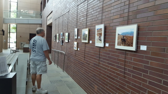
The Town of Cary always has various kinds of public art on display in all of its buildings. They host art loops and artists’ receptions, and seem to work hard at bringing the public different kinds of art in different mediums. So I thought the best thing to do would be to go on a tour with the person I know who would least appreciate it: my dad. I was actually surprised that he made stabs at what things might symbolize, although not at all disappointed by his amazing summations of exhibits. Behold:
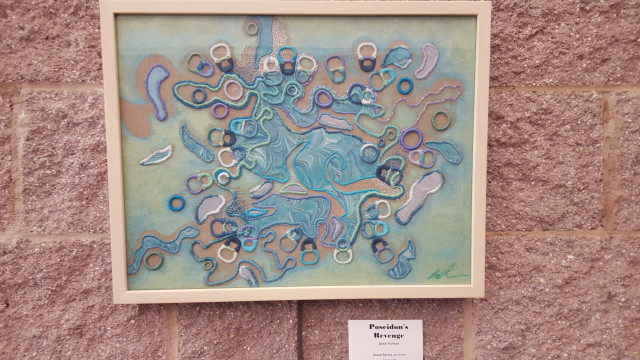
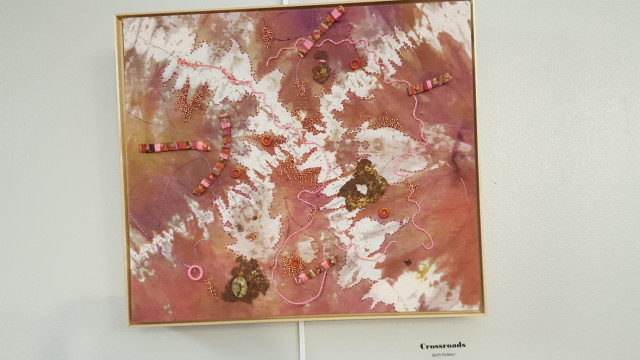
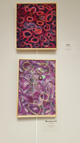
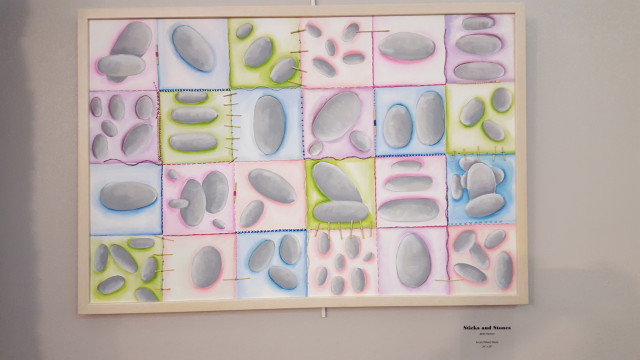
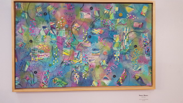
Beth Palmer: Fiber Art – Exploration in Color
Gallery Description: Beth Palmer is an artist who explores color and surface design in her work. Trained as a painter, she is always investigating new materials and techniques to enhance her work. History has always intrigued Beth. Found objects as well as old and antique materials are a fascination and one of the themes of her work.
Ron’s Description: “It was dyed cloth with a bunch of crap on it.”
Ron: The first one they had was “Poseidon’s Revenge”, which, when I looked at the title, I was thinking “Oh, we’re going to have something about Greek mythology,” and it’s just a bunch of loops and odd colors and everything else and if anything else it may be some abstract art of Medusa, but certainly not almighty god of the sea Poseidon. And it’s even got a bunch of browns in it, when you’d expect some greens and blues of the sea.
Ron: There’s two white squirrelly lines that look like they do cross, so I suppose there’s something there. But all of these other little things there, like the embossing [note: I think he means embroidering] and the circular embossing… it’s just clutter as opposed to art.
Ron: There’s another one called “Movements #2”. I think maybe she forgot that she named one of them Movements, and then she named the other one Movements, and, what the hell, she had to add the 1 and 2 on them to differentiate them. Though they are different, they’re not that different, so who cares? And this one named “Who” looks more like a bunch of red blood cells than it does anything like the interrogative nominative pronoun or the musical group. It doesn’t look like ethier of them. It looks like a bunch of red blood cells and blood. Actually, it’s much too thick.
Ron: This one is sort of nice. It’s called “Sticks and Stones,” and it’s got this rectangular pattern that does have sticks and then it’s got stones in it. This is the most literal one of all. And, you know, just seeing stones isn’t all that great a deal.
Me: So is that your favorite?
Ron: Oh yes… my favorite… my favorite… is… is… is… uh… that one’s really the most bizarrish thing. What’s it titled?
Ron: So it’s just chaotic totally. It’s difficult to try to make anything out of it, so maybe that’s the one I can give up on the quickest, so I wouldn’t waste as much time on it.
Me: So it’s your favorite?
Ron: It’s my favorite, yes.
Me: Would you put any of these in your house?
Ron: Uh… The only thing I could see useful is that you’re out in the garage and you’re using them as rags for painting or working on your machinery or something. That’s about all I would ever use them for.
Me: Burn.
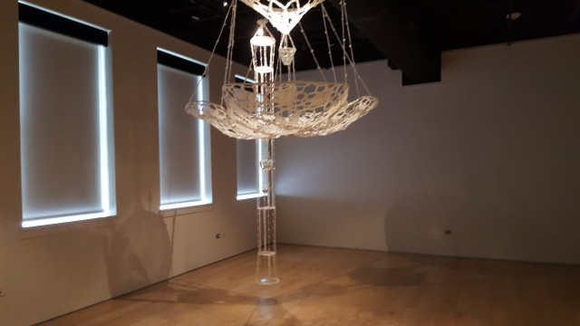
Cayce Lee: Gratitude for our Resonance
Gallery Description: Cayce Lee uses fiber techniques to create sculpture and installation art with found materials made of metal, plastic, and glass. Transforming the familiar by knitting, crocheting, and stitching, she is exploring the relationship between materiality and memory, emotion, and existential space. Her interest in the energetic qualities of the work connects her art to an ancient lineage of mystic traditions in textile history.
Ron’s Description: At least this has a lot of geometry to it.
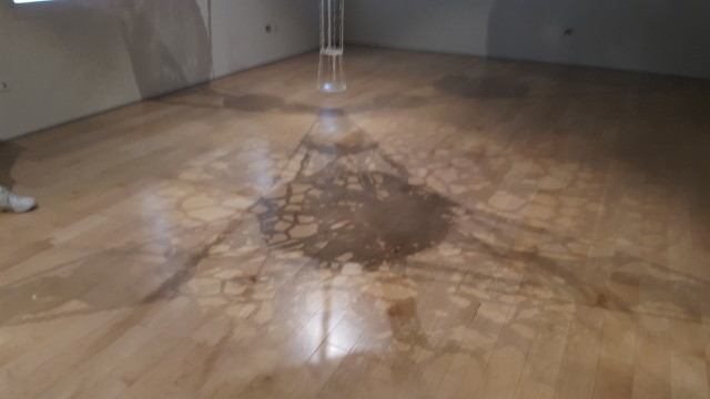
Ron: So this at least has a lot of geometry to it. And the lighting gives you the effect on the floor. It’s very geometric. I can see why this would be art.
Me: What do you think of the materials it’s made of?
Ron: Well, you know, using all that recycled stuff, it’s certainly cheap. You’re not spending a lot of money on materials, which is a good thing. Especially if you’re trying to make some money off it.
Me: Do you like this better than the other art so far?
Ron: Yes
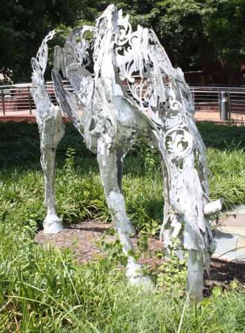
Victoria Reed: Dapple 1
Ron: Well, it’s obviously a hose that looks like it’s eating or drinking, and it’s interesting that it doesn’t have a middle. And I’m sure that’s supposed to be symbolic of something or other, though what, I have no earthly idea.
Me: Do you like this better than the other art?
Ron: Yes, it’s probably the best so far.
Amy Devereaux: Peru–An Unforgettable Journey
Gallery Description: The artist photographs and unforgettable journey to Peru. Her photos of Lima, Cuzco, Machu Picchu, and the Ollantaytambo Ruins document the distant land. Her incredible journey features visits to Moray and Maras (where she saw the salt mines and ancient agricultural terraces), to Racchi’s ancient ruins, to Puno (where she saw the man-made floating islands of the Llras on Lake Titicaca).
Ron’s Description: These pictures of scenes of aspects of life in Peru… there is some art there, and it’s probably more interesting because it gives me a literal picture of things and it doesn’t leave me as much to my imagination so I don’t have to figure out what the heck is the artist trying to tell me. So that’s probably convenient for me and I probably appreciate it a little more, since I don’t have the artist imagination.
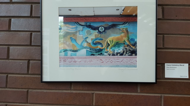
Ron: This one, Cuzco Cemetery Mural, is a picture of some art. It’s got the symbolicness of life and death with the snakes and the lions and the eagles. SO this is at least a nice picture of some Peruvian art.
Ron This whole picture as art thing… sometimes they can take some nice things that are demonstrative of art, but the overall effect is really more… The artisticness is in the capturing of what’s literally there as opposed to using some other medium to give an impression of what they’ve got. So it’s a different kind of art, and it’s really hard to compare it to other things like sculptures and paintings because the medium is so different.
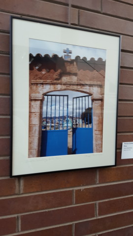
Ron: I’m assuming, for example, that this one with the gates with the cross and so forth is supposed to symbolize something with the gates being open, and it’s designed to maintain the sepearteness but allow, under certain circumstances, the traffic flow… And the fact that it’s open is supposed to give you some artistic impression.
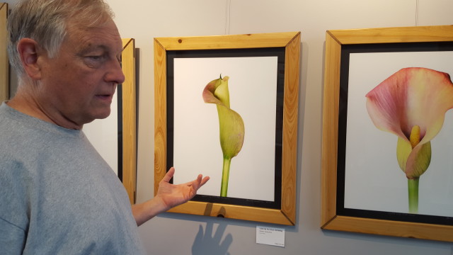
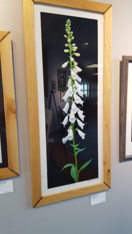
Robert Cassanova: Alice’s Garden
Gallery Description: Alice’s Garden celebrates photographs by Robert Cassanova along with horticulture by Alice Cassanova. Gardening is a metaphor for life that binds our past, present, and future. The patterns, shapes, and colors in botanical specimens have evolved over millennia in response to nature’s survival senses and inspire a deeper exploration of the underlying phenomena. Many of the botanical specimens shown are grown in the garden around Robert and Alice’s home in Eastern North Carolina. Robert’s high-resolution photographs capture the patterns, shapes, and colors in stunning detail with the use of a view camera and digital focus-stacking techniques.
Ron’s Description: He takes a picture and then processes it and prints it to give an impression of something, but it’s certainly not a Salvador Dali artistic kind of creation.
Ron: The only creativity is in the framing and what you pull out of the picture and put in the background. But that’s more graphic artist work as opposed to real artistic creation. I hate to say it, but even the first artist, whose stuff I really disliked, Beth Palmer, at least there were a lot of choices and creativity. Outside of figuring out the angle and the light and the post-processing, this is very much mechanical as opposed to artistic creation.
Me: So art is about how much skill is involved in creating it?
Ron: If it’s very common, you don’t appreciate it as much. If more went into the thought, composition, and production you consider it more valuable. But I think people who create things from scratch are even more to be appreciated. Only if they produce something that’s worthwhile. That first one didn’t produce anything worthwhile, but the process was difficult, and somewhat to be admired. But it fell short of being an admirable product. This is a little more admirable produce, but it didn’t really require…
Me: So you’d rather have this in your house, but you don’t think it’s art.
Ron: I don’t think it’s as artful. I think it’s art. Sort of.
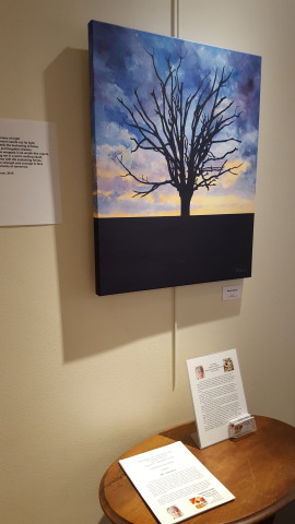
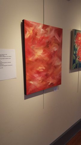
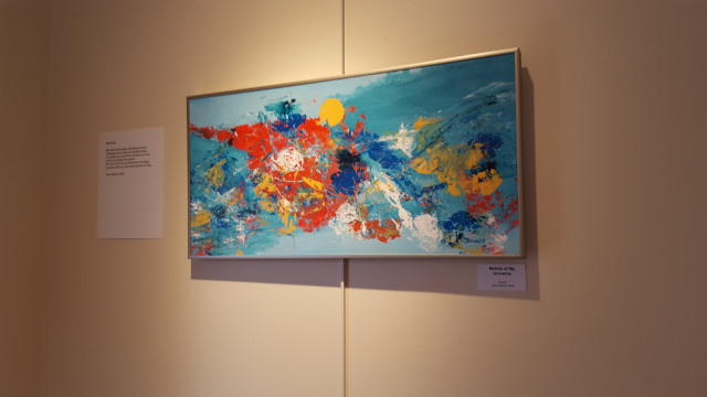
Jane Hanck: An Artist’s Journey
Gallery Description: This exhibition depicts the artist’s journey through life and the challenges that she encounters along the way. Whether it is the beauty and joy in a flower, the sadness of an old tree, or the sharpness of jagged rocks, the artist paints and writes with deep emotion. Each work has a story to tell.
Ron’s Description: Pictures and poems that go with it. But they’re certainly creative art, thematic, showing the theme. That’s pretty good stuff.
Ron: I don’t quite get the resurrection. It just looks like a dead tree. It’s sunset. The sun is going down. I think it’s more death and ending than resurrection.
Me: These are okay?
Ron: Yeah, there are pretty good art.
Ron: It like she just had one or two colors, and she wasn’t sure what to put on there, so she just did a bunch of random paint strokes, which she’s not so sure about. So I guess it’s aptly named.
Me: You were complaining about the names before, so…
Ron: It’s aptly named, but it’s not necessarily the greatest art in the world.
Ron: This one is the chaotic nature of her universe. And so I guess it pretty appropriately gives that impression. How much does this thing cost? It can’t be worth that much.
Me: (has price list) $200.
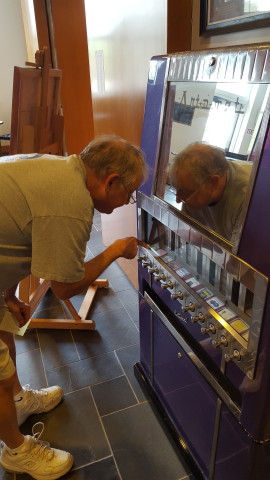
Town of Cary’s Art-o-Mat
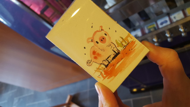
Town of Cary has this great art vending machine, made from a re-purposed cigarette vending machine! It’s super fun! Here’s what I got:
Dad got a mini-painting of flowers with a mini easel that I forgot to take a picture of.
Me: Do you think these are art?
Ron Yes. They meet the definition of art.
Me: What do you think of the Art-o-mat in general?
Ron: I think that’s a pretty neat thing. It’s a little on the expensive side, but I guess five bucks for this isn’t bad. I’d like to have a little more variety in the choices.
Me: So now that you’ve seen all the art, which exhibit do you think was the best?
Ron: The Jane Hanck exhibit. The art was the best there. It actually was original paintings that weren’t crap.
Me: What was your favorite piece of the day?
Ron Probably the favorite piece was not one that we saw. We only saw a picture of it, and that was the cemetery picture.
Me: What was the worst?
Ron: The first one we saw. I don’t know how you can consider yourself an artist if that’s all you do. Very disappointing.
Me: Did you enjoy experiencing art? Would you do it again?
Ron: It was not a total waste of time. Yeah, I’d go back. Depending on the other options. I liked the buildings and the art was okay.
I feel like that is the greatest praise Town of Cary is going to get for their public art.
