To complete my 2011 book list, where I vowed to give you The Good, The Bad, and The Ugly, here’s the Ugly list! Where I pass judgement over book covers that I’ve had to stare at for varying lengths of time this year.
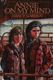
The rest of these won’t be in any order, but I really think this is the ugliest cover I’ve had to stare at this year. It’s a 1982 novel about two high school girls discovering their feelings for each other, and is actually really sweet. I could see it still being enjoyed by readers today, if this cover doesn’t completely turn them off. Hello, lumberjack vests!
Obvs you don’t want the cover art taking away from the real selling point, Hilary Duff’s name, but I feel like I could have made a better one for this book in MSPaint. It’s just a clipart picture of a flower, copied and slightly rotated. Step it up, Hilary Duff’s publicist.
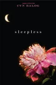
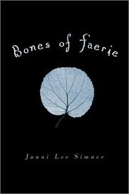
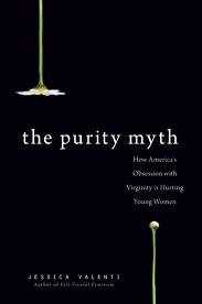
Speaking of covers influenced by Twilight, here are three more:
Flowers have something to do with sandmen right?
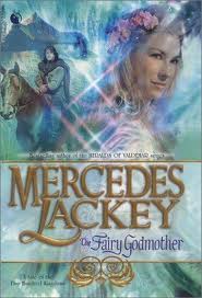
If you’re going to go with one thing on black, at least make it a fairy skeleton!
This was a pretty great non-fiction book by an author who, I’m pretty sure, would completely hate Bella Swan and her representation of femininity. The cover is actually fine on its own, but it earns a place on this list for reminding me of Twilight every time I have to look at it, something you know I can never forgive.
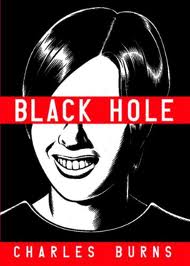
BLARGHARGHBLARGHRAWR STOP LOOKING AT ME LIKE THAT, YOU FREAK
I’m usually against any book cover where the author name is larger than the title, but this one has other problems too. That font? The attack sparkles? I can’t take it.
Oh, teeth.
So, I could be wrong, but I think this is the book I read this year that was kind of put together from lots of different suggestions from the author’s blog. I know I read something like that, and hated it, and this cover kind of looks like it was haphazardly designed by the same committee, so I’m going to say it was this one.
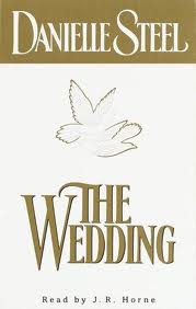
With the full panoply of Microsoft Office 95 wedding clipart available to you, you chose that?
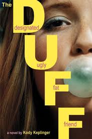
Are your lips deformed? Is your mouth oddly open? I can’t decide which is weirder, but either way it’s ugly.
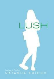
It’s a book about alcoholism; you had so many options! And you chose random cookie cut out on Carolina Blue. Ugh.
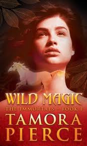
Y’all know I love a good Tamora Pierce, but these new covers they got at the library are graspin. What’s wrong with your face, Alanna? Are you a vampire?
Daine, you’re having horse-fever hallucinations again.
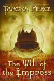
Either her creepy all-seeing eyes fill the jaundiced sky or she has a huge and really embarrassingly shaped pimple on her nose.
I actually think this cover is kind of appropriate for this book, but that still doesn’t mean I want to look at it.
You can’t give me a title like that and then just slap a picture of some annoying girl on there. I need to see some combat butlering!
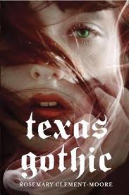
You know I love Rosemary Clement-Moore, but this cover really bothered me (luckily I read the book so fast, it wasn’t for long!). Amy! Close your mouth! Fix your hair! How are you supposed to fight the forces of darkness when you can’t even see straight and you’re choking on bugs??
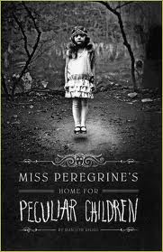
I didn’t like this book, and I think one of the big reasons is that the cover deceived me. This book is not a creepy-child horror story. This book is about time travel and a considerably more lame version of the X-men.
Already started my list for 2012!!!






[…] 2011 Book List: The Good 2011 Book List: The Ugly […]
Wow. What you didn’t tell me about “Annie on My Mind” is that the girls’ faces make them look like they’re each 45.
Also, time for your blog to host a Photoshop a Picture of a Combat Butler competition.