Time for the dubious awards of Ugliest Books I read this year. It should come as no surprise that this year’s winner is:
Nothing is uglier than a picture of Donald Trump, 80s style lol. Unless maybe it’s Donald Trump 2015. The rest:
Boring
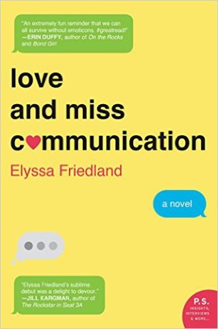
OMG I’m so frazzled, I’m trying to talk on two different phones while doing the dishes and holding random toys. WOMEN
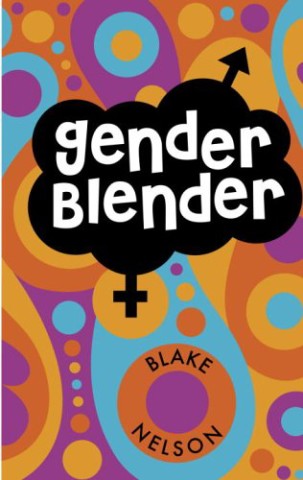
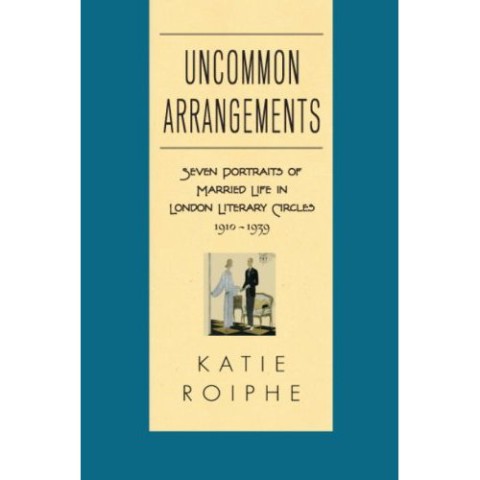
I get what this cover is trying to do, but the color scheme is all wrong.
Boring AND misleading
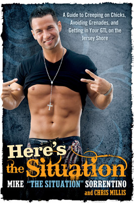
Here’s the Situation: A Guide to Creeping on Chicks, Avoiding Grenades, and Getting in Your GTL on the Jersey Shore “by” Mike Sorrentino
Oh god, do I even have to say
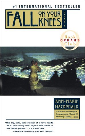
I actually liked this book, a family saga set in a remote seaside town. But the cover is doing nothing for me.
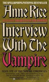
So much vampire iconography to choose from, and they go with this boring, terribly-colored thing
Boring
Has Bill O’Reilly on it
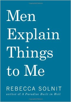
Boring and bad color scheme
Boring
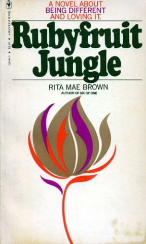
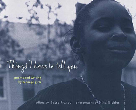
This cover doesn’t stand out at all. Even if it was color instead of black and white it would be more appealing.
Boring
So boring
Previously: 2015 The Bad, 2014 The Ugly
Next: Bonus Post: 2015 The Pretty


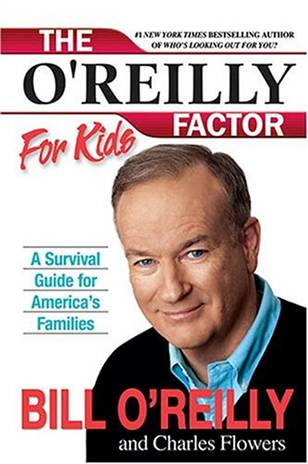


Oh god how did I forget that there’s an O’Reilly Factor FOR KIDS
1. You don’t like The Situation’s abs??
2. How was the Rebecca Solnit book? I am on the hunt for more of her writing.