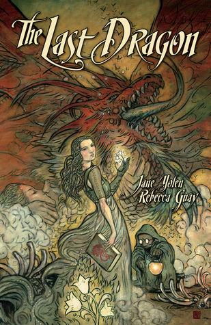
Mostly because I felt bad about going through the books I read in search of ugliness, I also picked out the covers I liked. Maybe doubling the number of books I read this year made me raise my standards, because there weren’t as many as I thought there would be. The best one was probably:
It’s a graphic novel, so I guess the art had better pull you in. Same with:
The art in this book was beautiful.
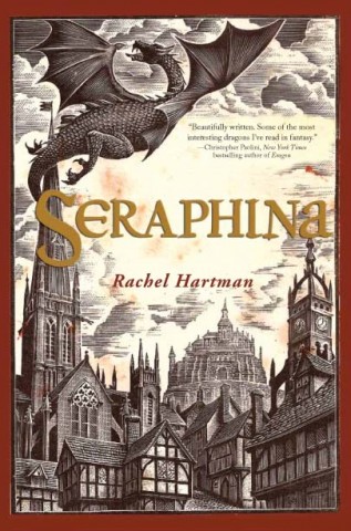
I also really like this cover, because it advertises the story so well: early modern period + dragons
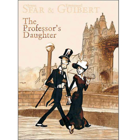
This was another graphic novel about an Egyptologist’s daughter who falls in love with one of the mummies he brings home. The art style is different, but I kind of like it.
The cover is what first drew me to this book: it’s perfect.
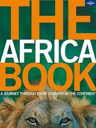
I read a lot more non-fiction this year than ever before, and they do a really good job of pulling you in with evocative photographs like this. For instance:
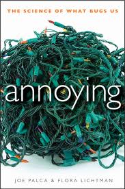
I actually bought this book, because I was hungry and that cover
This is a pretty great reference book on Africa: lots of detail, lots of great pictures
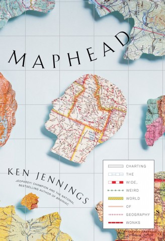
I don’t know why I like this one so much. Maybe it’s the colors, or maybe it’s that I too find maps really aesthetically pleasing. For instance, on the wall across from me right now:
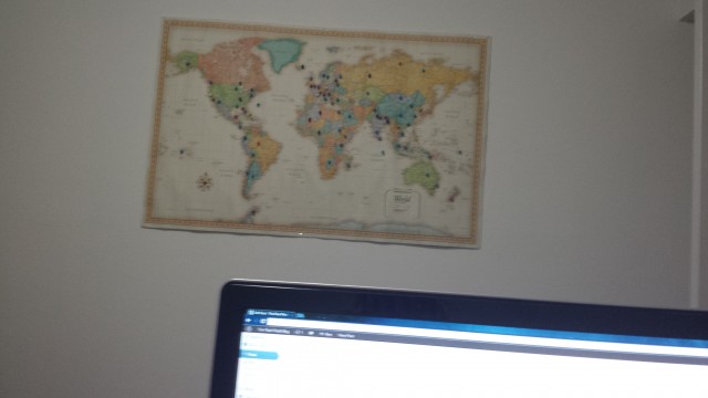
I claim I need it to keep track of stuff for my book (which is admittedly also true), but really I just like the way it looks
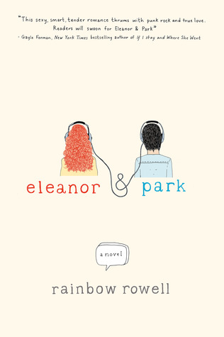
Finally two Rainbow Rowell covers, that I love
A good year of books. I don’t think I’ll be making a reading goal for next year. It’s too stressful and takes some of the joy out of it.
2013: The Good
2013: The Bad
2013: The Ugly
2012: The Pretty
