One of my favorite times of year!! The time when I look back at all the books I read and judge them shamelessly by their covers!! Some of these will be familiar from The Good and The Bad lists, because ugliness isn’t an indicator of quality.
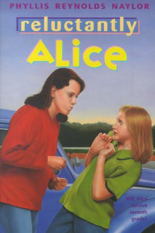
I read this whole series this year, and a lot of them were published in the 80s and 90s, which were like the golden years for terrible children’s book covers like this where they went for illustrating a scene in the book. Just so we’re clear, that’s the middle school bully trying to beat her up, not a cross-country trucker.
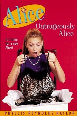
Even when Alice is in a sexy situation instead of a scary one, it’s just as awk and ugly.
This book was on my Good list, but I really think they could have designed a better cover. The book is full of really cool visuals! He lives at a drive-in movie theater with a neon sign the size of a building, come on.
I feel awkward staring at this girls chest in her boring tank top.
This cover is okay, but the book was pretty funny, so I wish it was better.
Alice is invited to a lingerie-themed bridal shower. I know, I was disappointed too
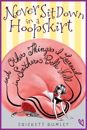
I’ve fallen down in a hoop skirt before, and that is not what it looks like.
AH GOBLINS!
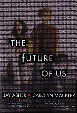
I actually really like this concept: two 90s kids get magical access to their future facebook profiles and then try to change their lives to “fix” what they see.
That is bad-acting mopey, AT BEST. I was promised agony.
I almost didn’t put this on here, because it does get you perfectly prepared for what you are about to read. But, come on, he’s a sexy lion man.
