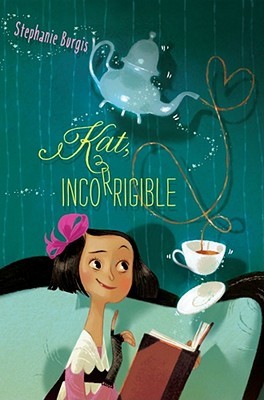
I felt kind of bad looking through my Goodreads account just for bad covers when there were so many nice ones this year too, so I thought I would show you those too:
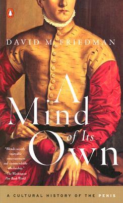
Is this not just the PERFECT cover design for this subject? From the fancy olde timey guy to the placement of the O. Awesome.
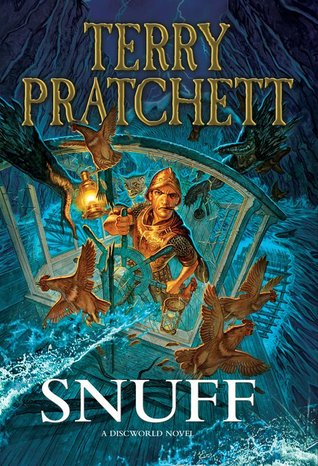
His ship is sinking and he still has a cigar in his mouth. I love it.
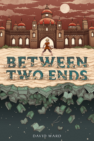
I read this book solely because the cover was so cool looking! I ended up giving it only two stars. It was alright, but didn’t live up to the hype of its cover.
The illustrations in this one in general were really detailed and good. The cover also continues around to the back, which I like.
Non-fiction books seemed to have impressed me more in general this year, especially in the cover department. Maybe I expect less.
Creeeeeepy
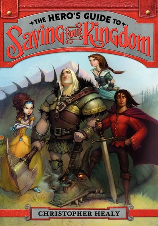
This is another book like Jane Austen except everyone has magic, this time for middle grades. I think the cover fits the tone pretty perfectly.
One day a bunch of people all over the world just disappear, and those that are left wonder what the heck happened. Thought it would be a Left Behind knockoff, but actually wasn’t religious at all.
Excited to start reading in 2013!
